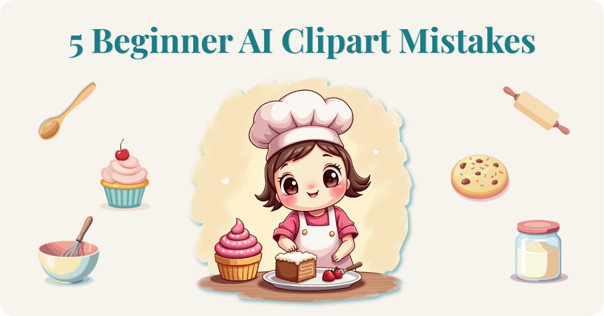
5 Mistakes Beginners Make When Creating AI Clipart
Creating AI clipart for beginners can feel a little like magic at first.
If you’ve tried creating AI clipart for printables or digital products, you’ve probably had this moment.
The first image looks promising.
The second one looks… different.
By the fifth, your “set” feels like distant cousins at a family reunion.
Many people starting with AI clipart for beginners run into the same common problems.
That’s not a creativity problem. It’s usually a planning problem.
A clipart set simply means a group of images that clearly belong together — the same style, the same vibe, the same visual language. Beginners often skip the one step that makes that possible.
Let’s walk through five common mistakes (and simple ways to fix them) so your next set actually looks like a set.
Mistake #1: Starting Without a Clear Style Plan
Cohesion doesn’t happen by accident.
It happens because you decide the rules before you start.
When you skip that step, you get what I call style drift. One image is soft watercolor. The next one is bold vector. By the sixth, you’re not even sure what you’re making anymore.
Your eye can tell in two seconds whether a set belongs together. So can a buyer’s.
Lock the Style Before You Generate
Before you prompt anything, decide:
- The objects in your set
- The overall vibe (cute, vintage, minimal, playful)
- Line style (thin outline, thick outline, or none)
- Shading style (flat, watercolor, paper-cut, etc.)
- A limited color palette (3–6 colors)
- Background (clean white is usually easiest)
- Angle (front view keeps things simple)
Color consistency is one of the biggest signals that a set belongs together. If one cupcake is dusty pastel and the next is neon bright, your brain feels the clash immediately.
Pick your palette once. Reuse it.
Ask for a clean white background. It makes removing the background easier later and simplifies the finishing process.
Turn Your Style Plan Into a Repeatable Prompt
Once you’ve decided the rules, combine them into a consistent prompt structure.
For example:
Isolated clipart of a whisk, flat vector style, thin outline, soft pastel palette (pink, butter yellow, soft blue), front view, simple detail, clean white background, no text, no watermark, no extra objects.
Then change only the object.
Whisk → Muffin → Rolling Pin → Mixing Bowl.
Stability creates cohesion.
If your generator allows image references or style matching, use your strongest image as a visual anchor. That’s often easier than trying to describe the style again and again.
If your set already looks mixed, don’t scrap everything. Identify the strongest image, adjust your style recipe to match it, and regenerate the outliers.
Smaller finished sets beat one confusing bundle every time.
Mistake #2: Using vague prompts, so the AI fills in details you didn’t want
AI tools are powerful, but they are also enthusiastic guessers. When a prompt is vague, the AI tries to fill in the missing pieces. That often leads to extra objects, strange hands, random text, inconsistent outlines, or busy backgrounds that make the image harder to use.
Different generators behave a little differently, which is why choosing the right one matters.
If you’re still exploring tools, you might also find this guide helpful: How to Pick the Right AI Image Generator.
I generated the examples in this post using Artistly, a newer tool I’ve been experimenting with recently. I’ve been really impressed with the clean results it produces for clipart. If you’re curious, you can learn more about Artistly here.
For example, a prompt like:
Cute baking clipart, pastel
doesn’t tell the AI very much. It doesn’t specify how many objects you want, what style to use, what the outlines should look like, or whether the image should be a single object or a full scene.
When that happens, the AI fills in the blanks however it wants. That often leads to extra objects, strange hands, random text, inconsistent outlines, or busy backgrounds that make the image harder to use.
You may have heard the phrase “less is more,” but with AI prompts the opposite can happen. When you give the AI a vague prompt, it tries to help by filling in the blanks. That often means more objects, more detail, and more clutter than you actually wanted.
Sometimes the results are adorable — just not very practical for clipart.
Clear prompts make a huge difference.
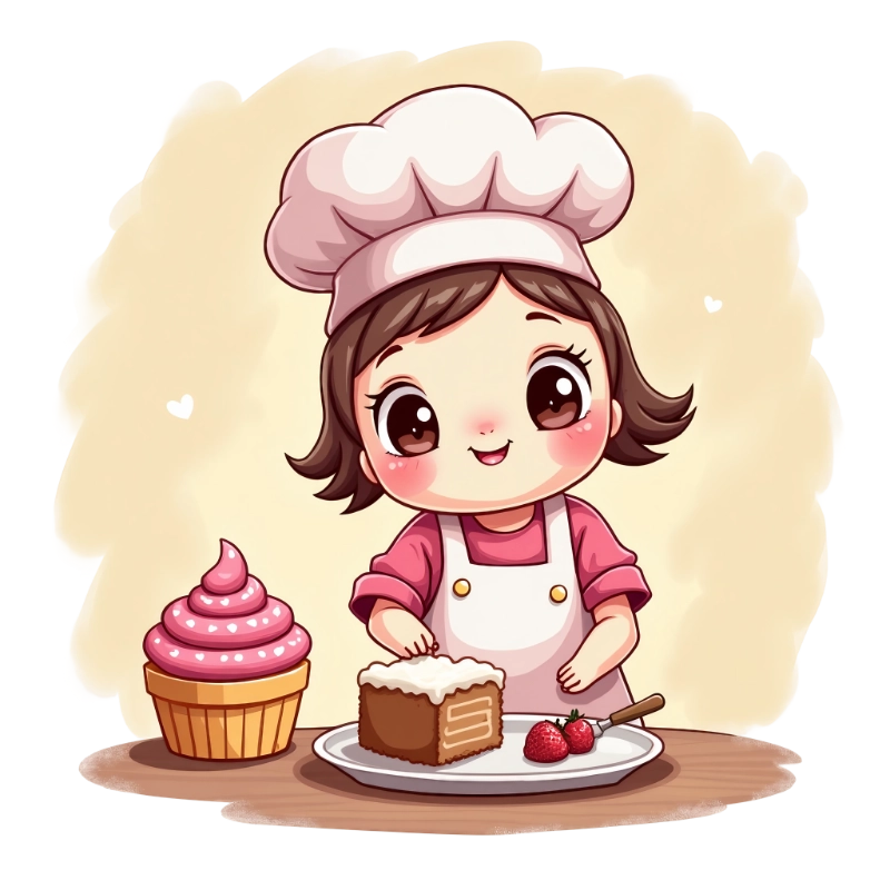
The vague prompt I shared above — “Cute baking clipart, pastel” — actually produced this cute baker illustration. It’s charming, but it’s a full scene with overlapping objects. Trying to separate those elements later into individual clipart pieces would be frustrating. Items overlap, backgrounds blend together, and the edges aren’t clean.
AI can also decide to add extra personality you didn’t ask for.
I mean, really?
When a prompt is vague, the AI fills in the blanks however it wants. In this case, suddenly the mixer, cupcake, and rolling pin all have smiling faces. Cute… but not exactly the clean, simple clipart you were trying to create.
For clipart sets, you usually want the opposite: one simple object at a time, clearly separated and easy to reuse.
Use “include” and “avoid” language to stay in control
Clear prompts give the AI better instructions. Instead of leaving it to guess, tell it exactly what you want to see — and what you don’t.
If you want to go deeper on prompt structure, I break it down further in Better Prompts, Better AI Images.
A helpful structure for beginner prompts includes:
• the subject
• the style
• the color palette
• the composition
• the background
• and anything you want the AI to avoid
For example:
Vague prompt
“Cute baking clipart, pastel colors”
Clearer prompt
“Single clipart of a whisk, flat vector style, thin outline, pastel palette (pink, butter yellow, soft blue), centered, isolated on a clean white background, simple shapes, no text, no watermark, no extra objects.”
You’re giving the AI a clear blueprint. The result is much more predictable and much easier to use in a clipart set.
When AI adds words, logos, or odd artifacts, try this first
If you see strange marks, accidental letters, or tiny shapes that look like text, try this simple troubleshooting process:
• Simplify the prompt and remove unnecessary descriptive words
• Add instructions like “no letters, no words, no logo, no watermark”
• Generate a few variations and pick the cleanest result
• If needed, regenerate the image using the same prompt
It’s normal to try a few tries before you get exactly what you want. Clear prompts make that process much faster.
Mistake #3: Forgetting How Clipart Is Actually Used
Clipart isn’t just a cute image.
It’s a building block.
It has to drop into Canva, a printable page, a sticker sheet, or a planner layout without a fight.
Two common surprises beginners run into:
“It looked fine on my screen, but it prints fuzzy.”
“I can’t remove the background cleanly.”
Both usually trace back to decisions made early in the process.
Keep It Clean
Plain backgrounds are your friend. Busy textures can leave halos when you remove the background later.
Give each object breathing room as well. Consistent spacing around your images makes a set feel intentional instead of cramped.
Resolution Without Getting Technical
Start with the highest quality setting your generator allows. Avoid exporting tiny files “just to test.”
Even if you plan to use an upscaler later, it’s always better to start with the largest, cleanest version you can.
Test print one page early. What looks fine on screen can look tired on paper.
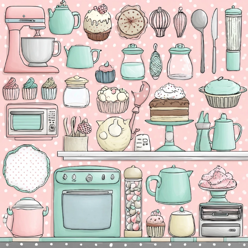
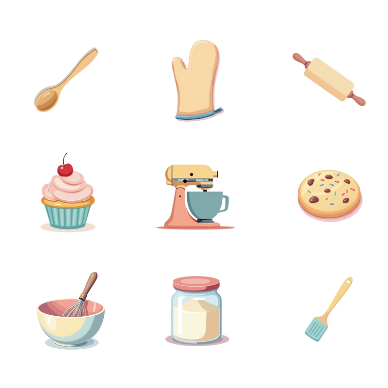
These multi-object grids are adorable, but separating them cleanly for real clipart use can be frustrating. The items are packed closely together, so you end up fighting edges, spacing, and background texture. And because each item starts relatively small, you lose detail quickly when you try to isolate or resize them. Even upscaling later can only recover so much.
Mistake #4: Creating Without a Repeatable Workflow
When you generate images without a plan, you end up making new decisions every time.
That’s exhausting.
Instead, build a simple workflow you repeat.
- Pick one theme and list 8–24 objects
- Lock your style recipe
- Generate one strong example
- Adjust once if needed
- Repeat using the same structure
- Do a quick quality check
- Upscale and remove backgrounds if needed
- Export and organize clearly
Once you understand the workflow, creating AI clipart for beginners becomes much easier.
A repeatable workflow makes the finishing steps easier. When your images are consistent, small cleanup tasks like background removal, resizing, or minor edits become much faster.
It’s easy to keep making images and never actually finish a set.
Finishing one small, cohesive set will teach you more than endless generating ever will.
Mistake #5: Skipping the Real-World Test
Clipart can look perfect in a preview grid and still fail inside a real design.
Thin lines disappear when you shrink them.
Soft colors turn muddy on darker backgrounds.
Edges look jagged in print.
A quick test saves hours of frustration.
Drop 3–5 pieces into the tool you actually use — Canva, Affinity, PowerPoint, or your printable layout.
Resize them small and large. Place them on light and dark backgrounds. Print one sample page if you plan to sell printables.
Fix issues early. It’s much easier than rebuilding a product later.
Before You Start Your Next AI Clipart Set
If your clipart has felt chaotic, it’s not because you’re not good at this — or that you can’t learn to be great at it.
It’s usually because no one told you to lock the recipe first. Creating AI clipart for beginners doesn’t have to be complicated. The key is simply avoiding a few common mistakes.
Pick one theme.
Write one simple style recipe.
Create one small, cohesive set.
Not perfect. Just consistent.
That’s how confidence builds.
NOTE: The example clipart in this article was generated using Artistly, one of the AI tools I experiment with when creating clipart sets. If you’re curious, you can learn more about Artistly here.
A bit of Wisdom
“Good clipart doesn’t come from complicated prompts. It comes from simple ideas repeated with intention.”
Creating AI clipart for beginners doesn’t have to be complicated. Most messy results come from a few small decisions that snowball into bigger problems.
Once you understand how to lock your style, write clearer prompts, and follow a simple workflow, creating cohesive clipart sets becomes much easier.
Small sets. Clear prompts. Consistent style.
That’s the whole game.
Here’s to making magic,
Terre | Beautiful Creative You
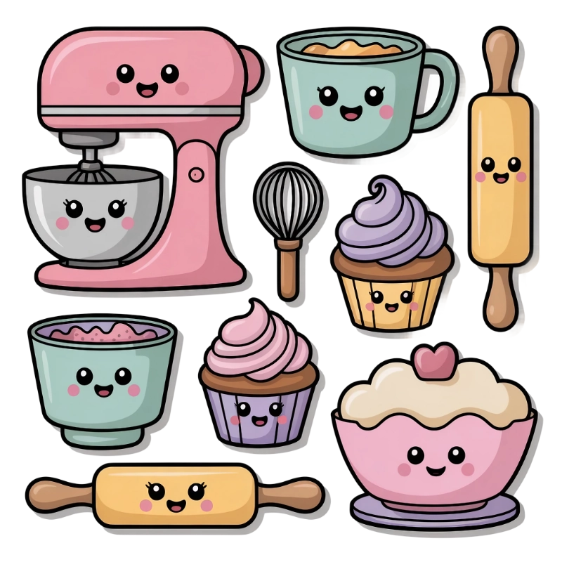
🌟 BONUS: A Small AI Clipart Set for Beginners
If you’d like to see what a cohesive beginner-friendly set looks like, I created a small Cozy Baking Mini Clipart Set using the same process described in this post. Download the Cozy Baking Mini Clipart Set here:
👉 Grab Your Free Cozy Baking Mini Clipart Set here »Use it in your projects, study how the images work together, or simply use it as a reference when creating your own sets.
💜 Let’s stay connected!
I’d love to cheer you on and share even more creative sparks with you:
- Join the conversation in my free Facebook group: Beautiful Creative You Community
- Follow me on Facebook
- Follow along on Instagram
- Find fresh ideas on Pinterest
🌟 Come say hi — I’d love to see what you’re creating.
By the way, some links in this post may be affiliate links, which means I may earn a small commission if you choose to purchase through them (at no extra cost to you).